Address Hotels + Resorts
Brand Refresh
2022
Client : Address Hotels + Resorts
Agency : Brandinc., Dubai
Project Manager: Amr Rostom
Year : 2021
Art Direction: Amr Rostom, Brandinc.ae
Designer: Rajlal
Website: addresshotels.com
Brand Identity refresh
Brand Identity Guidlines
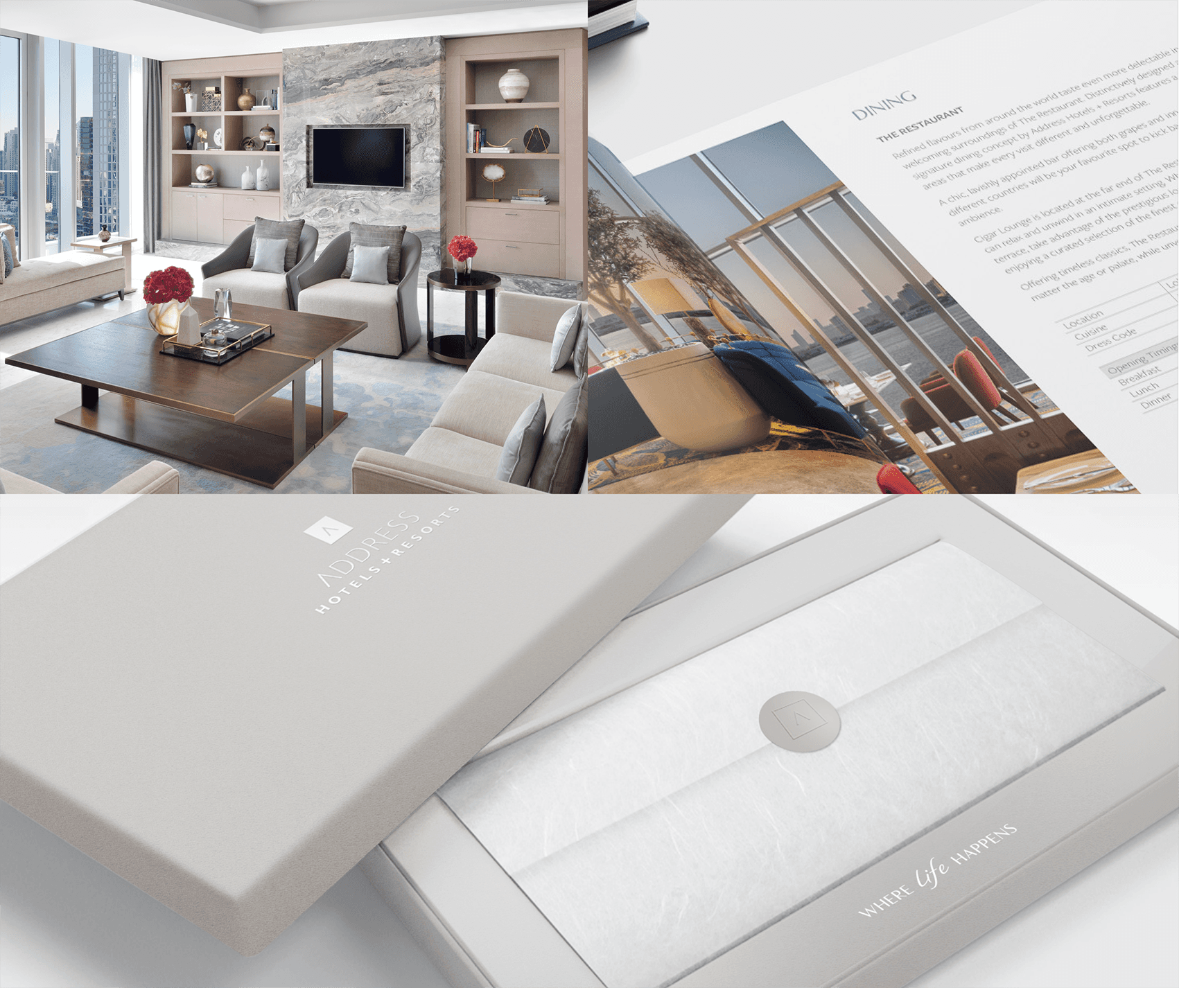
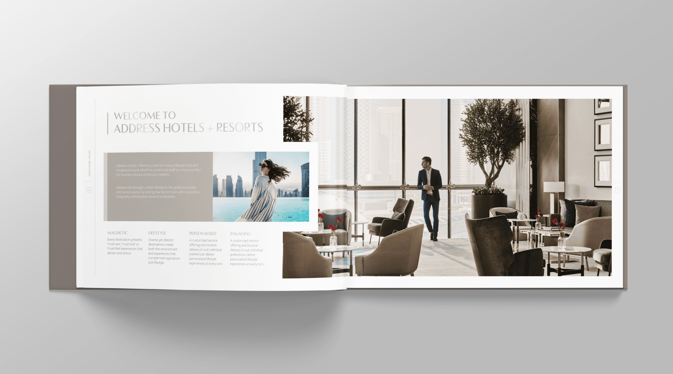
Brand Collateral Development
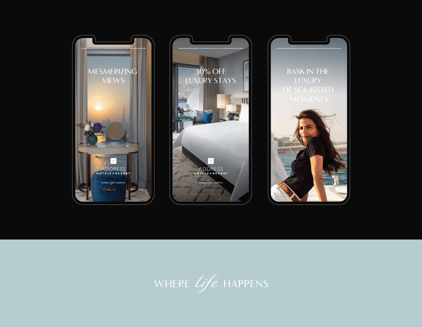
Digital Branding
Print Design
Case
Having collaborated with Brandinc.ae, I had the pleasure of spearheading the design overhaul for Address Hotels + Resorts, Dubai. Address Hotels + Resorts epitomizes the essence of being the ultimate destination, the heartbeat of every vibrant locale. From conceptualization to execution, every aspect of the brand refresh was meticulously crafted to embody Address's core values as the epitome of unforgettable experiences. Through close collaboration with Brandinc.ae, we infused Address Hotels' visual identity with vibrancy and sophistication, ensuring that every touchpoint resonated deeply with their guests. Our designs seamlessly integrated across digital platforms and physical spaces, showcasing Address Hotels as the pinnacle of luxury and refinement.
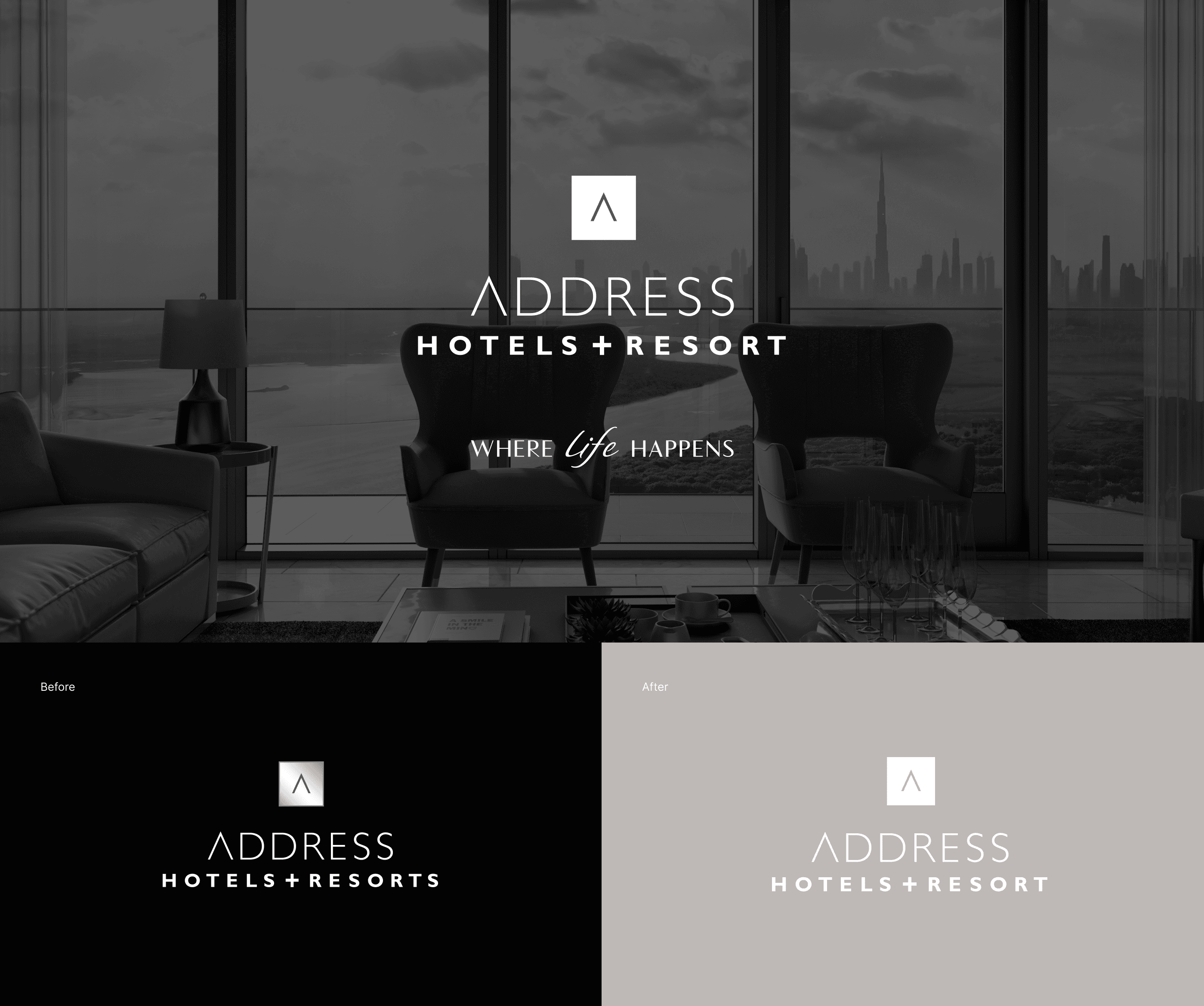
Brand Colours
In our branding strategy, we've meticulously curated color schemes to differentiate between their
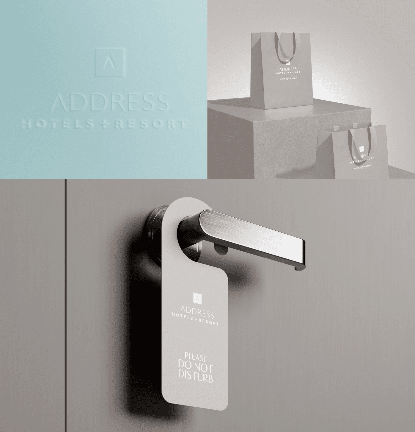
city-based hotels and beachfront resorts. The brand's base color serves as a consistent element across all properties, unifying our identity on items like in-room amenities and restaurant sugar packets.
For city hotels like Address Boulevard and Address Downtown, we employ a distinct hotels color scheme, while their beach resorts, such as Address Beach Resort and Address Beach Resort Fujairah, showcase the vibrant resort color palette.
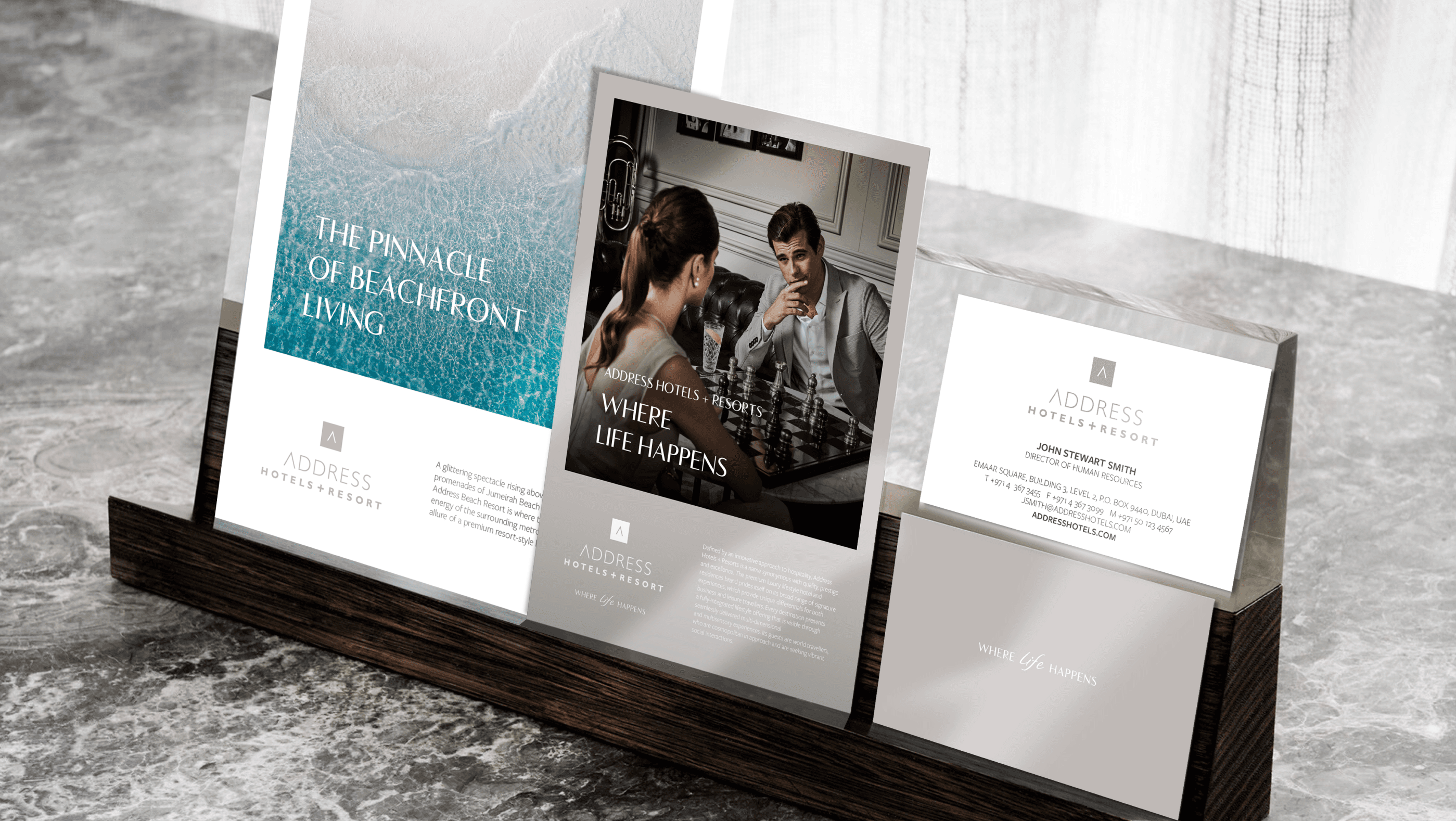
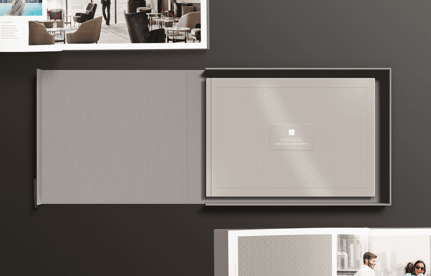
To further enhance brand cohesion, we utilize resort and city colors for specific collateral like notebooks, ensuring a seamless and distinctive brand experience across all touchpoints.
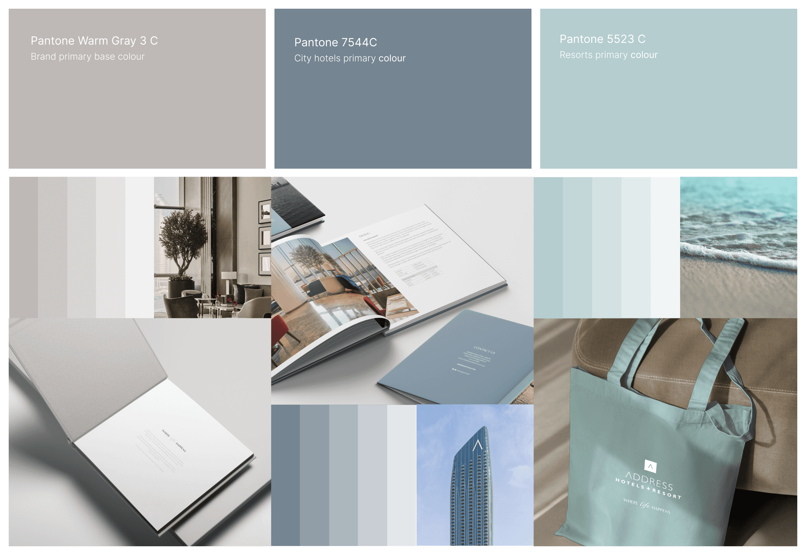
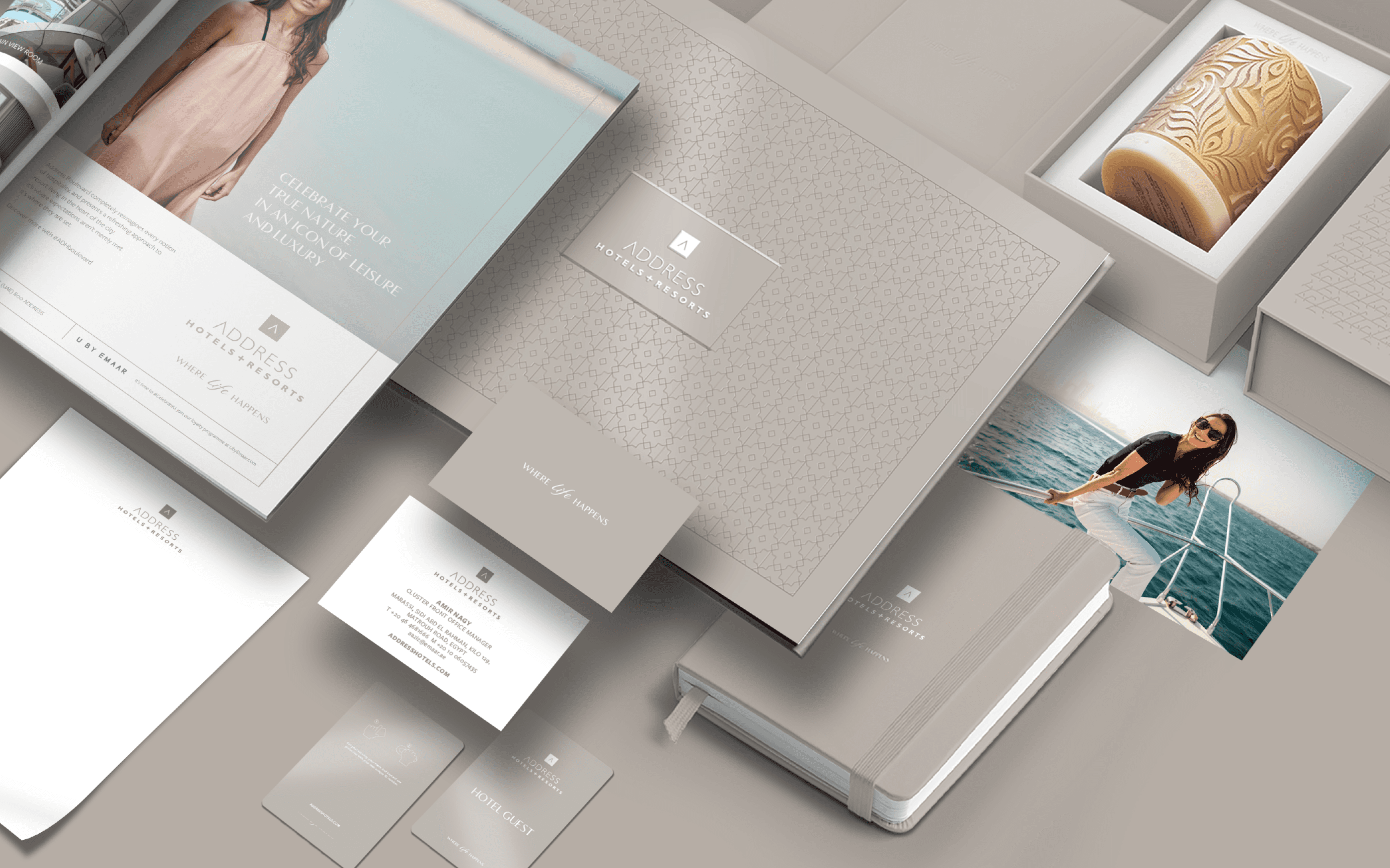
Brand Patterns
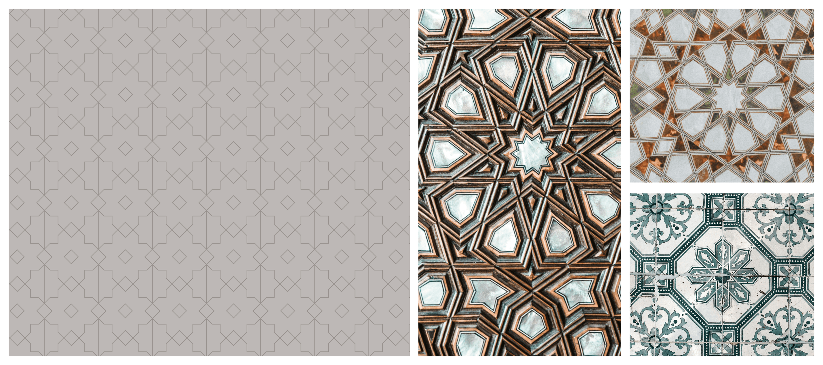
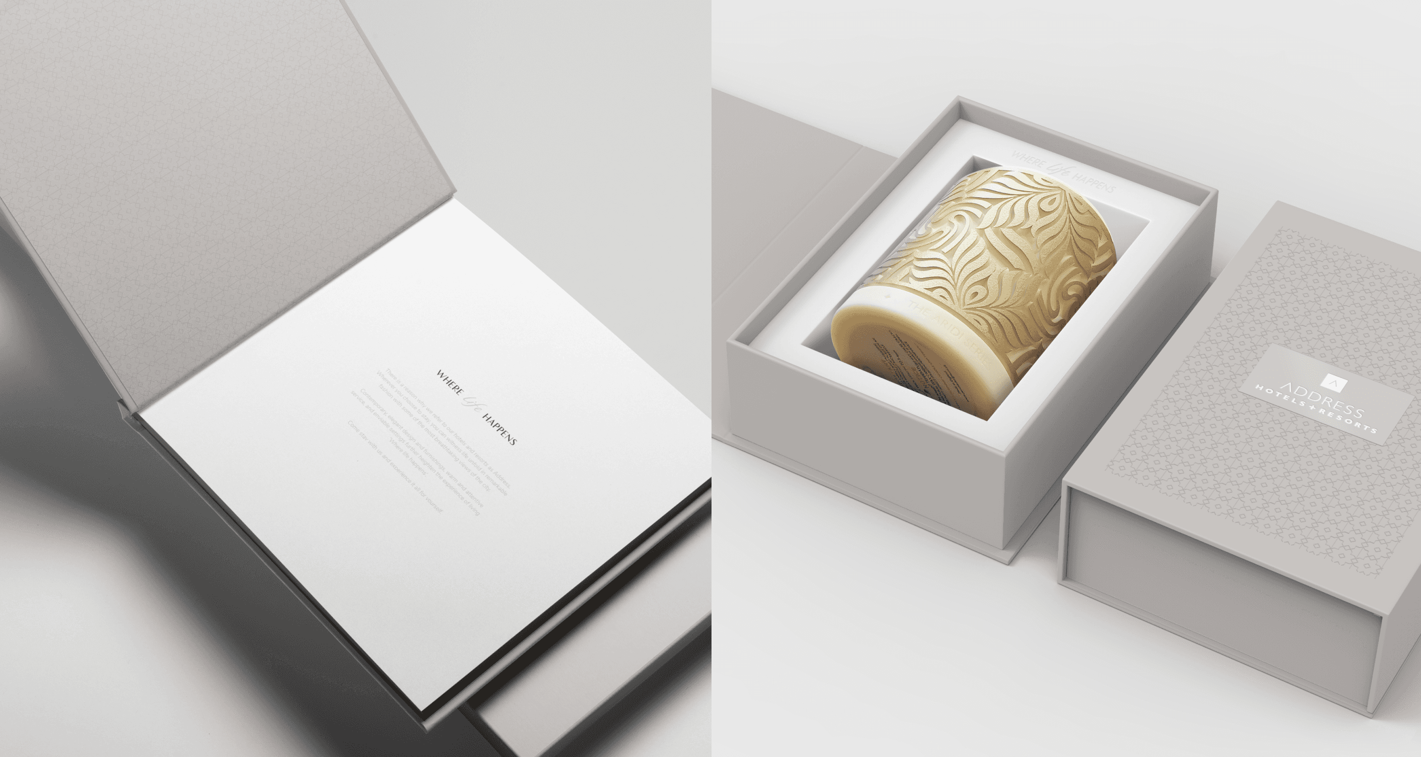
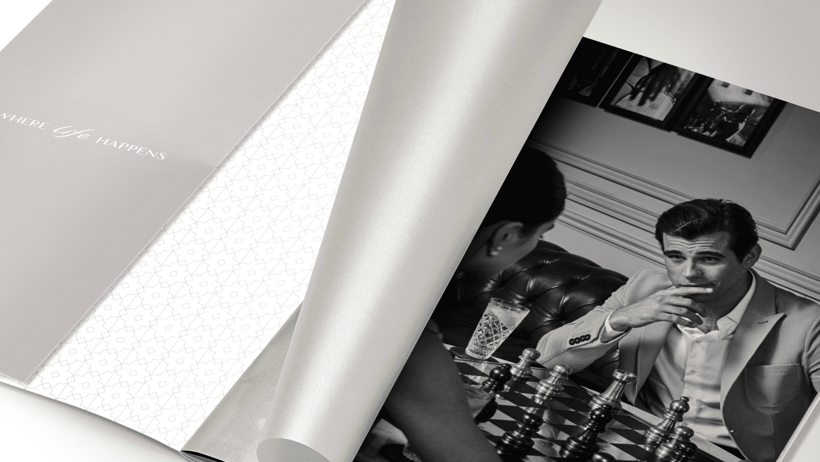
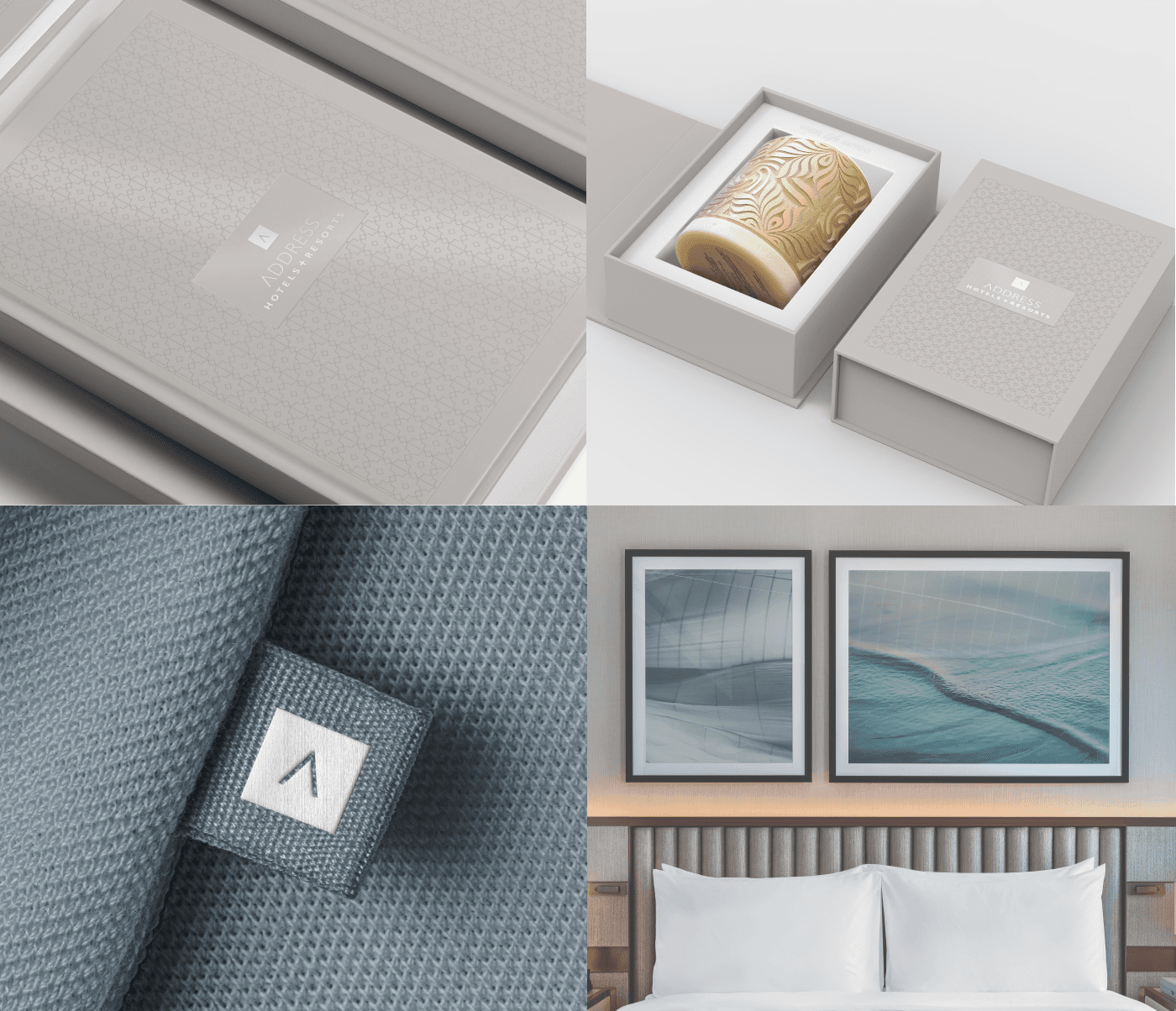
In our branding strategy, we've ingeniously crafted a brand pattern that seamlessly weaves together the opulence of Middle Eastern allure with a dash of modern flair, creating a sensory journey through time and culture. Drawing inspiration from the intricate geometries of Middle Eastern patterns, the design is elevated with a contemporary twist, reflecting Dubai's dynamic spirit.
Brand typography
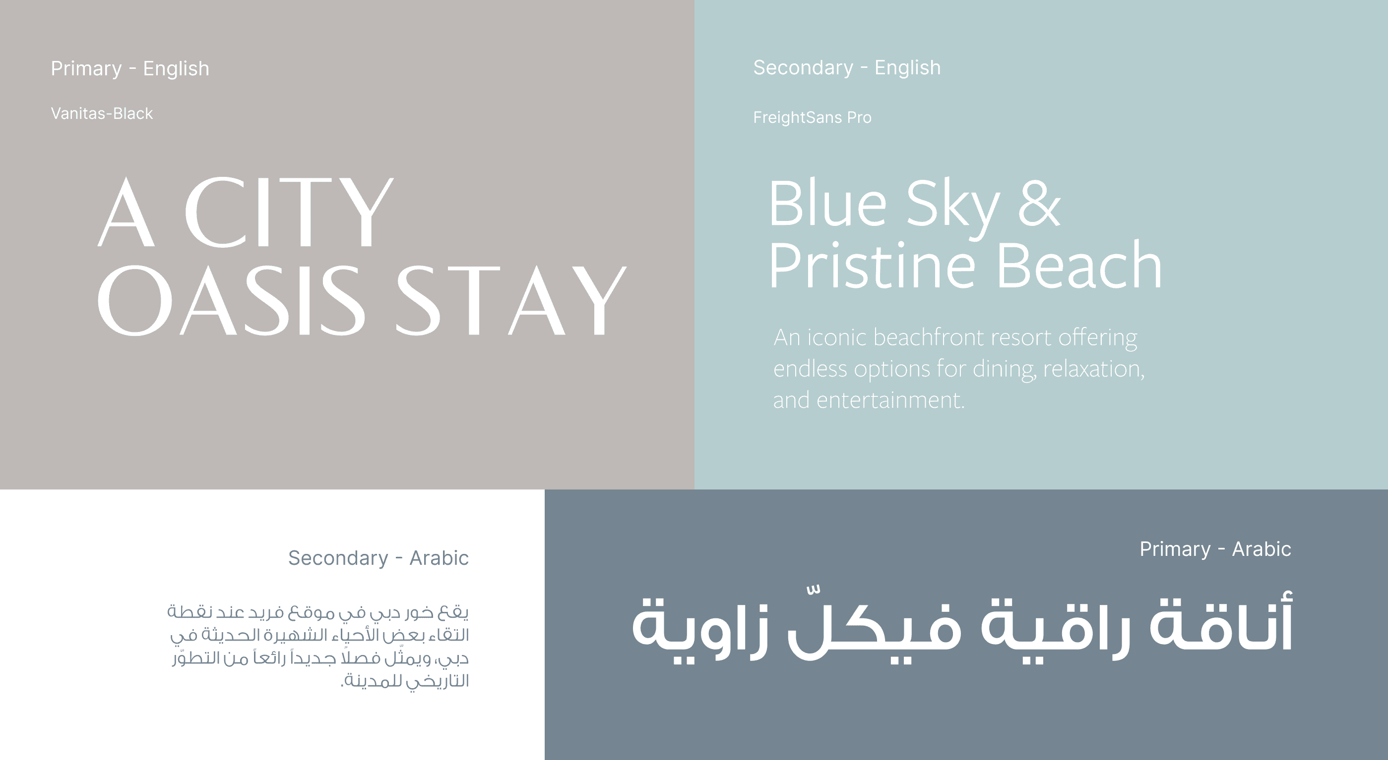
Primary English Typeface is Vanitas-Black. Featuring subtle curves and a cool edge, it is highly functional but with a sophisticated, muted grace.
Brand tagline
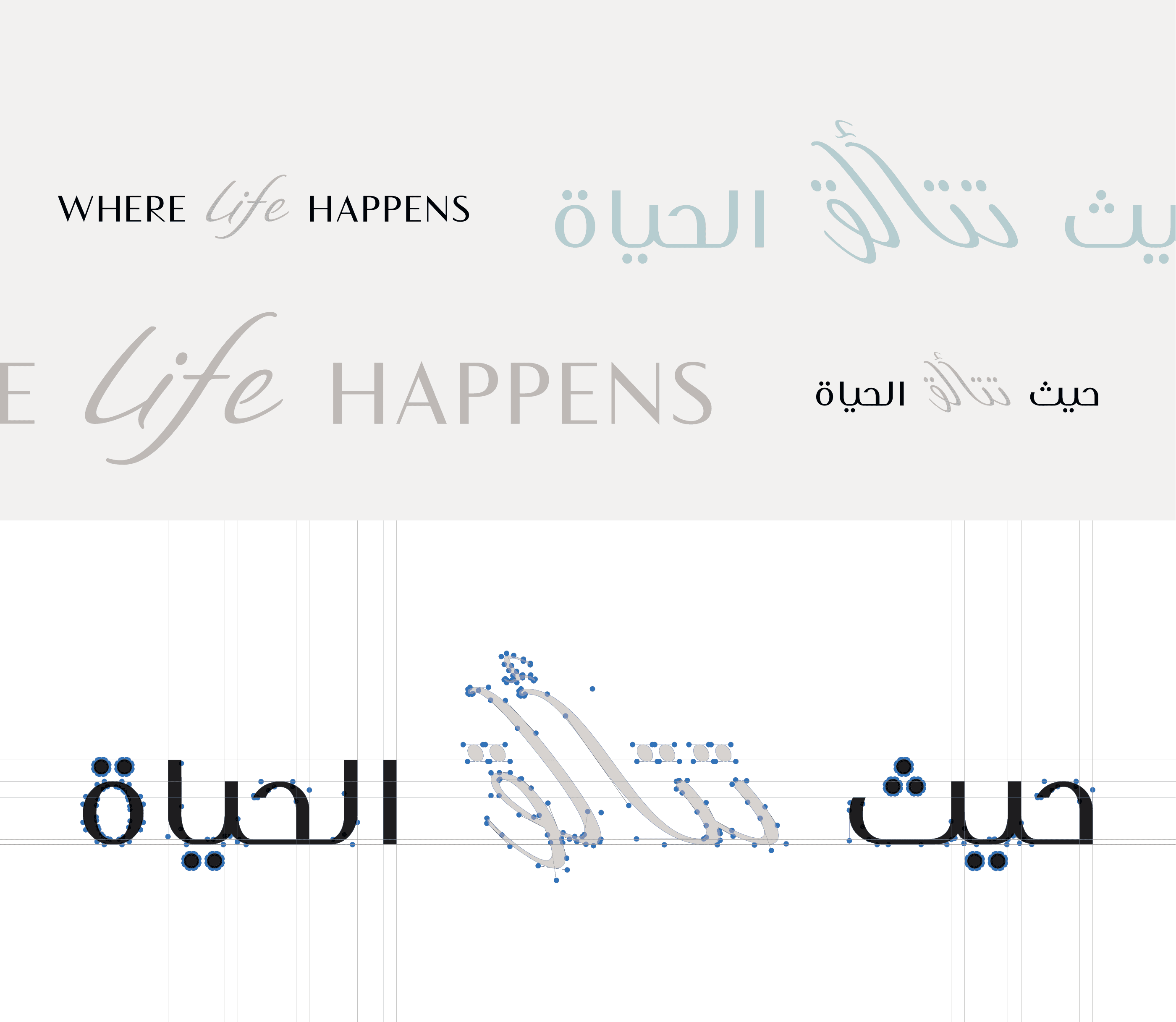
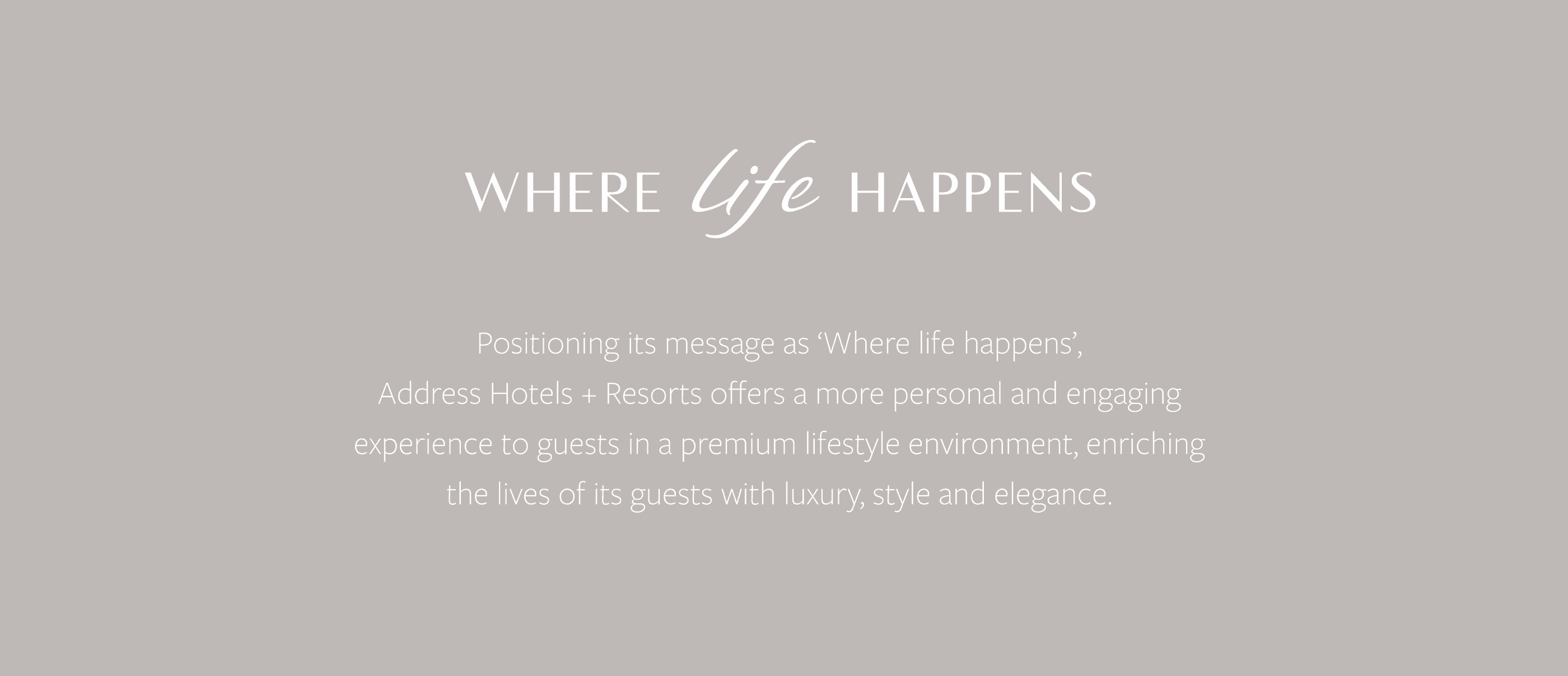
We have created and updated a new tagline with a new font, meticulously crafted to blend the elegance of English script with the enchanting allure of Arabic calligraphy. Each detail meticulously designed, this unique fusion of fonts not only pays homage to the cultural richness of the region but also symbolizes a forward-thinking ethos.
Thank you for scrolling
Please note: Only a selection of my works is featured on this website.
For more design samples, visit my Behance portfolio.
