Case
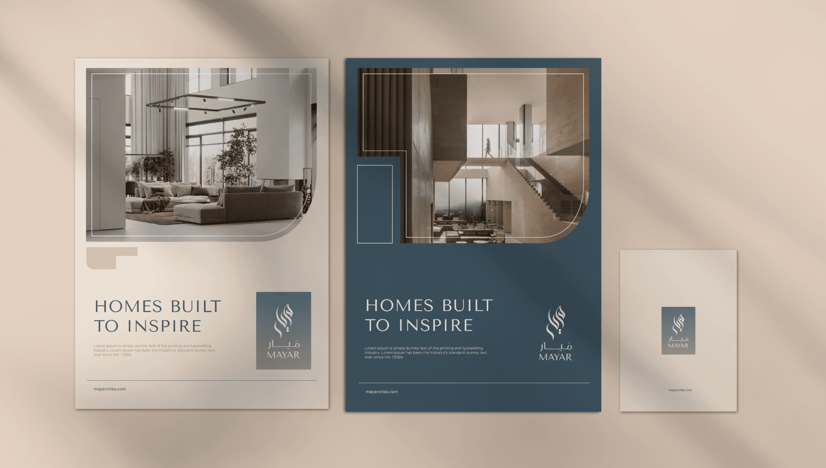
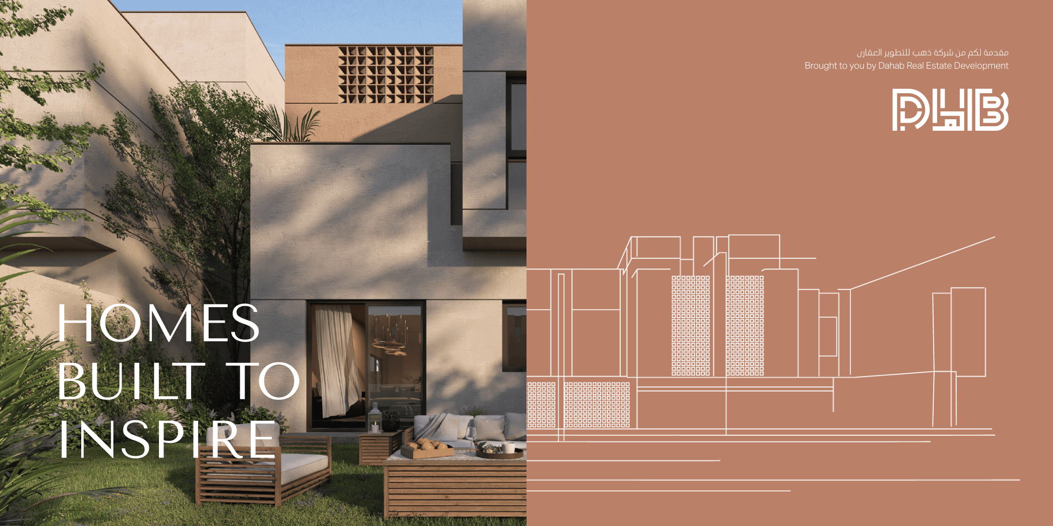
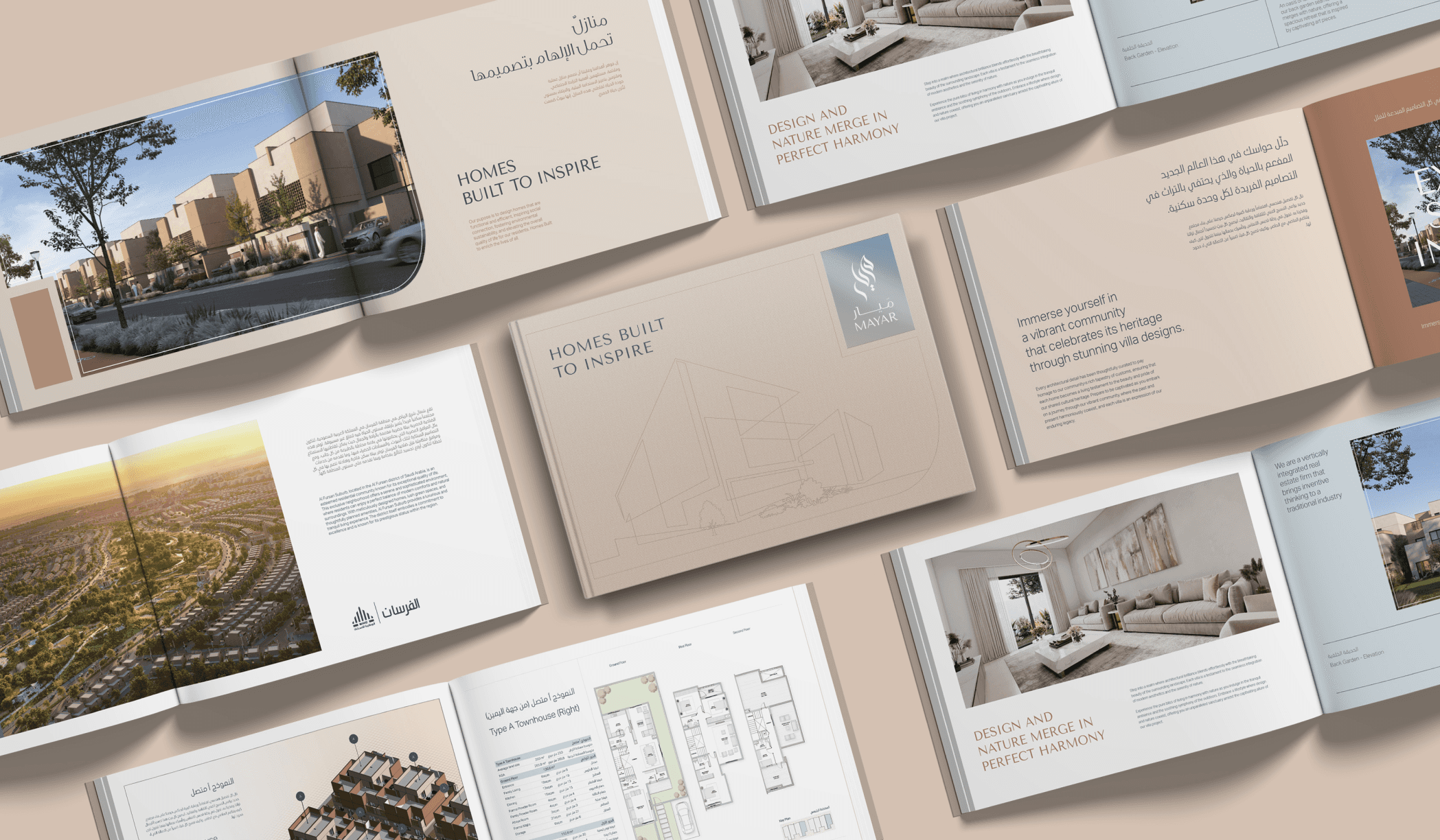
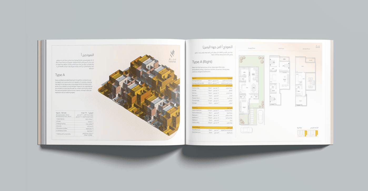
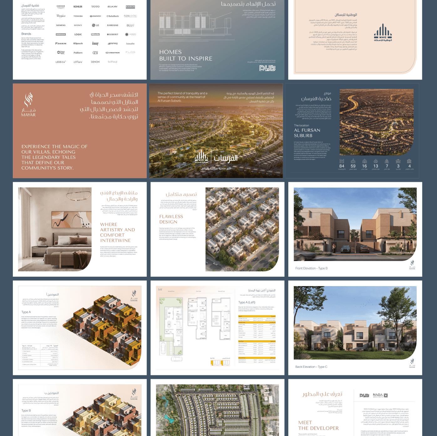
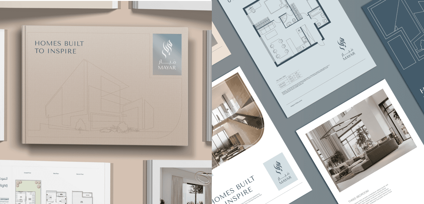
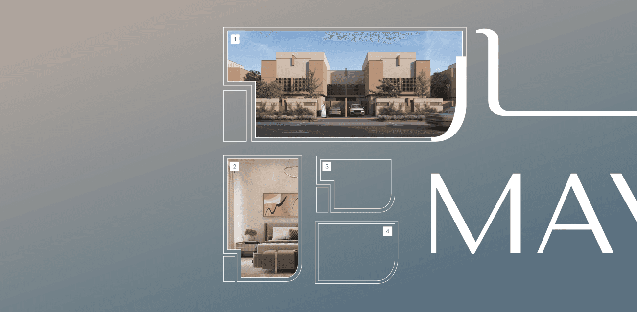
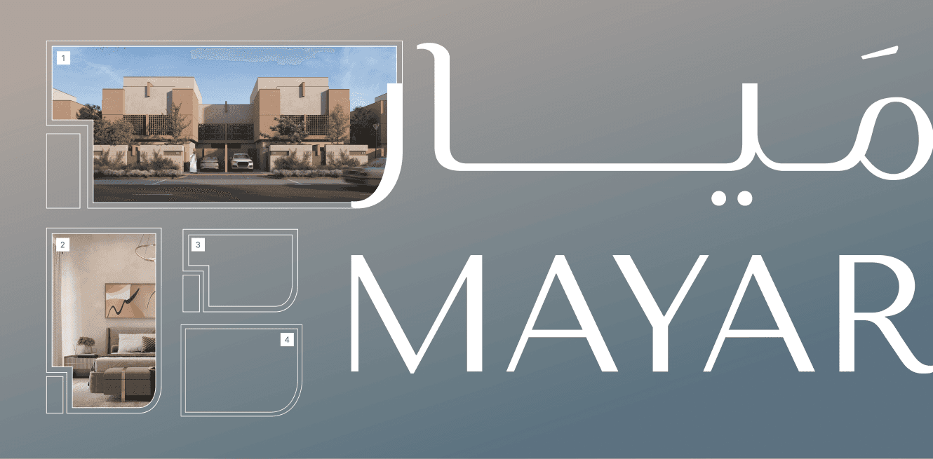
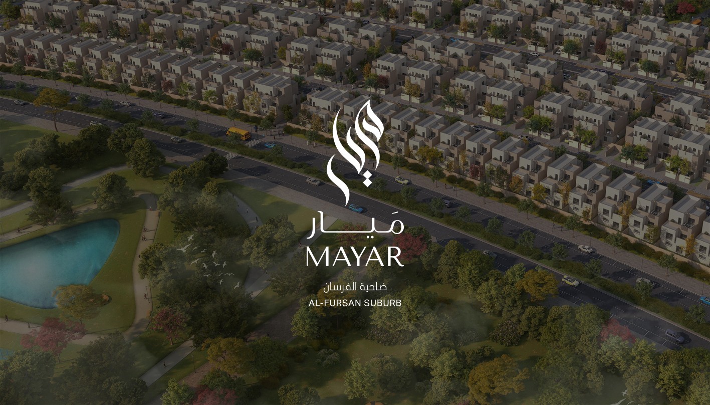
In collaboration with Brandinc.ae, I've worked on the branding for Mayar Development, where community is central. Mayar is dedicated to crafting homes that epitomize community living, promoting social connections, environmental sustainability, and enhancing residents' quality of life. Their homes are a testament to their commitment to enriching lives and fostering vibrant communities.
Brand Values
Community
We believe in fostering a sense of togetherness that extends beyond the walls of our individual homes, and creating shared spaces and opportunities for residents to come together
Brand Logo Scalability
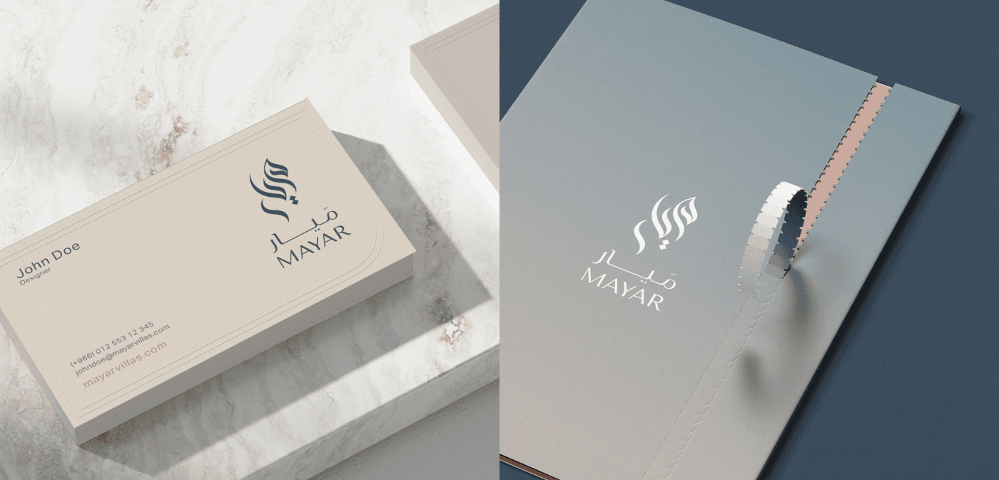
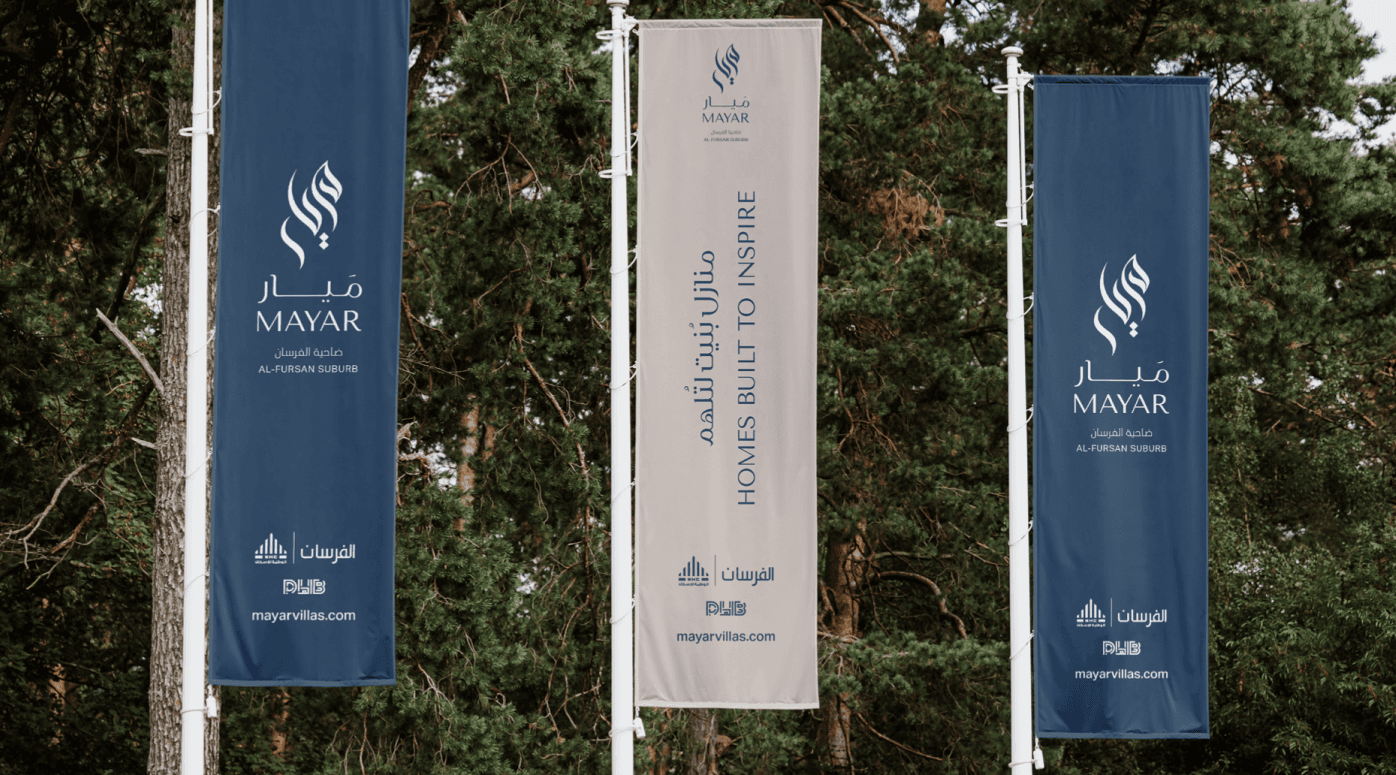
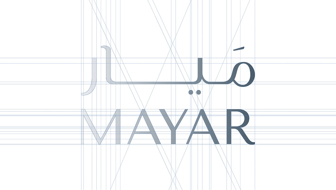
The logo design features a unique blend of Arabic calligraphy and a horse image, which effectively conveys the relationship with the masterplan 'Al Fursan' while also representing its rich cultural heritage.
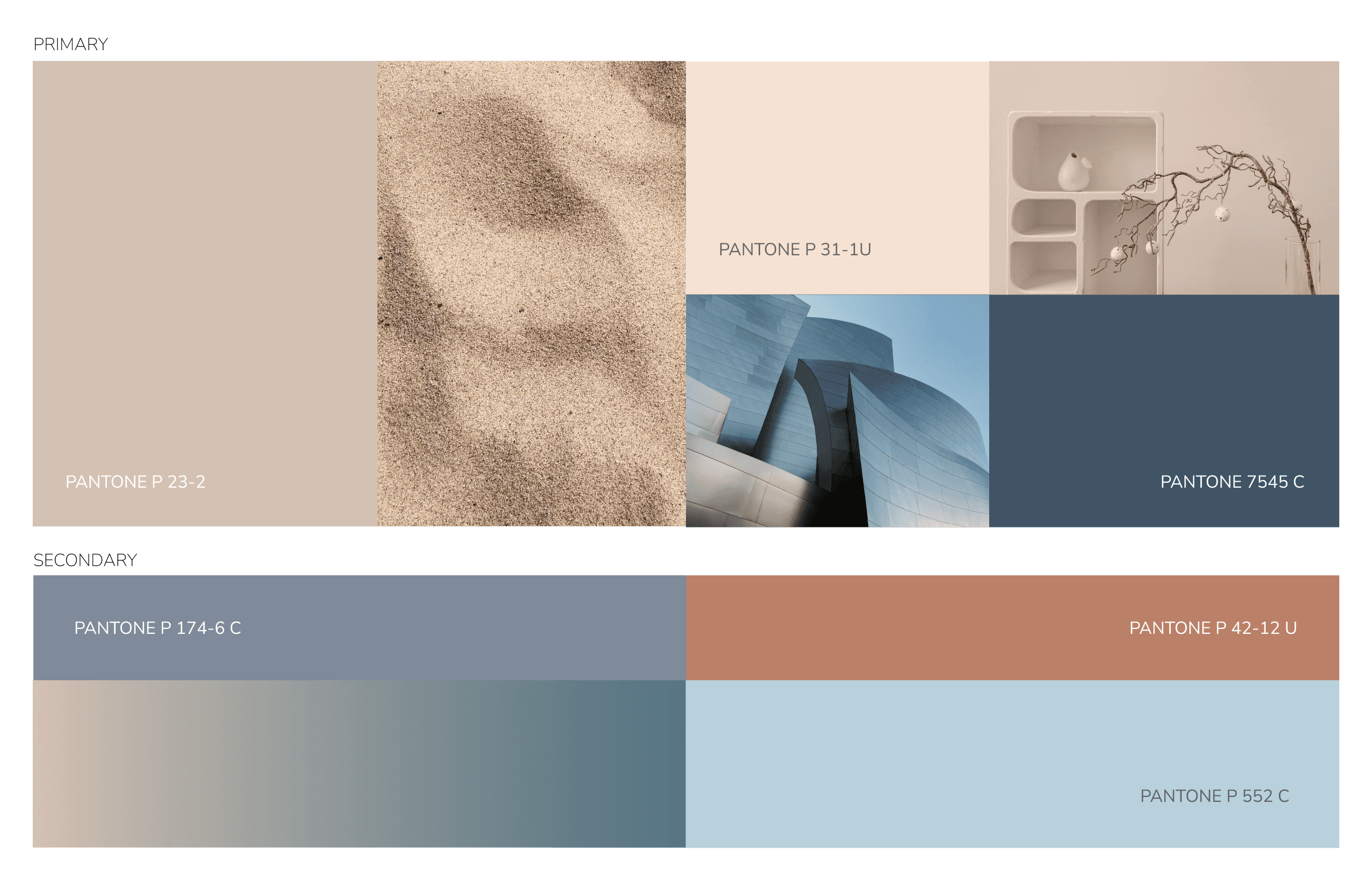
Brand colours
A color palette that evokes a sense of elegance and comfort. Our tones work together to create a subtle and sophisticated look.
Typography - English
We chose two typefaces that work harmoniously together while complimenting the structure of the logo.
The Tenor Sans is the Primary brand typeface, while Aktiv Grotesk is the secondary typeface.
Typography - Arabic
Both typefaces utilise the curves and character of the English typefaces
GE Hilli is the Primary brand typeface, while Aktiv Grotesk is the secondary typeface.
EXPERIENCE THE MAGIC OF OUR VILLAS, ECHOING THE LEGENDARY TALES THAT DEFINE OUR COMMUNITY'S STORY.
